You know that sinking feeling when you’ve poured hours into a digital illustration, perfecting every brushstroke and color blend, only to add text that feels… flat? Generic? Like it belongs on a default PowerPoint slide from 2003?
Here’s the truth: your artwork deserves better than system fonts that make your carefully crafted designs look amateurish. The right procreate fonts can transform your digital art from “nice” to “I need to save this immediately.” Whether you’re lettering motivational quotes for Instagram, designing wedding invitations, or adding that perfect finishing touch to your illustrated book cover, typography isn’t just decoration—it’s the difference between scroll-past and double-tap.
The challenge? Finding high-quality procreate fonts that actually work seamlessly in the app, install without headaches, and match your artistic vision. That’s exactly why I’ve tested dozens of font families to bring you this curated collection of 10 game-changing procreate fonts that’ll revolutionize how you approach lettering in your digital work.
Let’s dive into the fonts that belong in every digital artist’s toolkit.
Table of Contents
Why Typography Makes or Breaks Your Digital Art
Before we explore specific fonts, let’s address something crucial: typography isn’t just about making words readable. It’s about creating visual hierarchy, establishing mood, and guiding your viewer’s eye through your composition.
Think about the last time you scrolled through Instagram or Pinterest. The designs that made you stop weren’t just beautifully illustrated—they had typography that complemented the artwork so perfectly it felt intentional, cohesive, and professional. That’s the power of choosing the right Procreate fonts for your projects.
When you’re working on your iPad, you need fonts that respect your creative workflow. Unlike traditional design software, Procreate’s touch-based interface demands typography that’s both versatile and visually striking at any zoom level. The fonts I’m sharing today meet exactly that standard.
How to Install Procreate Fonts (Quick Guide)
Before we explore each font, here’s your simplified installation process:
- Download the font file (.TTF or .OTF format) to your iPad
- Open the Files app and locate your download
- Tap the font file to preview it
- Hit “Install” in the top right corner
- Confirm with Face ID or Touch ID
- Launch Procreate and find your new font in the text tool
Pro tip: If your font doesn’t appear immediately, close and reopen Procreate. Still having issues? Check that you have enough storage space and that your iPadOS is updated.
Now, let’s explore the fonts that’ll transform your typography game.
The 10 Essential Procreate Fonts Every Digital Artist Needs
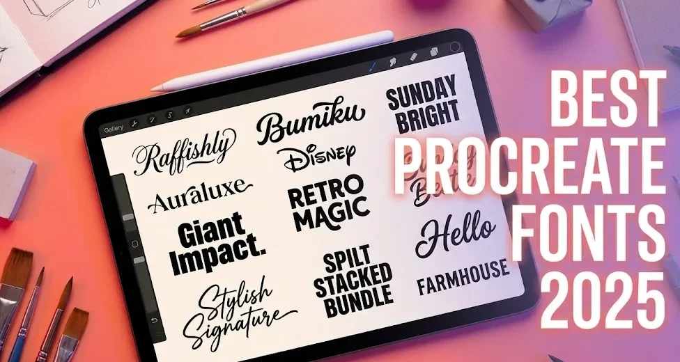
1. Raffishly – Elegant Script That Flows
Best for: Wedding designs, feminine branding, quote graphics, romantic illustrations
Raffishly brings that sophisticated, handwritten elegance you see on high-end invitations and boutique branding. Its flowing connections between letters create natural rhythm, making it perfect when you want your text to feel graceful rather than rigid.
What makes Raffishly special is how it mimics authentic brush lettering without looking overly ornate. You can pair it with minimalist backgrounds for maximum impact, or layer it over watercolor textures for dreamy, artistic compositions. When you’re designing anything that needs to feel personal and premium, Raffishly delivers.
Pro technique: Use Raffishly for your main headline, then pair it with a clean sans-serif for supporting text. This creates beautiful contrast without competing for attention.
Download Raffishly and add sophisticated flow to your next project →
2. Bumiku – Playful Organic Lettering
Best for: Food illustrations, children’s books, fun branding, product packaging
If Raffishly is the elegant cousin at the wedding, Bumiku is the fun friend who makes everyone smile. This playful, organic font features an irregular baseline that adds movement and energy to static designs. Letters bounce and dance, creating instant personality.
Bumiku shines brightest in projects where you want to convey joy, approachability, or whimsy. Food bloggers love it for recipe cards, children’s book illustrators use it for character dialogue, and small business owners choose it for packaging that feels handcrafted rather than corporate.
The irregular spacing might seem challenging at first, but that’s exactly what gives Bumiku its charm. Embrace the organic feel—your designs will look more human and less robotic.
Bring your designs to life with Bumiku’s playful charm →
3. Auraluxe – Luxury Multi-Font Collection
Best for: High-end branding, fashion illustrations, elegant invitations, premium packaging
Here’s where things get exciting. Auraluxe isn’t just one font—it’s a complete typography system featuring script, serif, and sans-serif variants that work together beautifully. This is your Swiss Army knife for sophisticated design projects.
Use the script version for eye-catching headers, the serif for elegant subheadings, and the sans for clean body text. This trio creates visual harmony while maintaining hierarchy, making your designs look professionally art-directed. When you’re building a brand identity or creating multi-page projects, having a cohesive font family is invaluable.
Fashion illustrators particularly love Auraluxe for its runway-ready sophistication, while wedding designers appreciate how the three styles create cohesive invitation suites without monotony.
Elevate your portfolio with Auraluxe’s timeless elegance →
4. Giant Impact – Bold Grotesque Sans
Best for: Modern branding, streetwear designs, bold statements, urban art
Sometimes subtle isn’t what you need. Giant Impact delivers exactly what its name promises: heavy-weight, attention-grabbing typography that demands to be noticed. This grotesque sans-serif works beautifully for contemporary projects where you need your message to hit hard.
The geometric construction keeps Giant Impact readable even at massive sizes, while the bold weight ensures your text never gets lost in busy compositions. Urban artists love pairing it with street photography, while product designers use it for packaging that needs to pop on crowded shelves.
Here’s a styling trick: combine Giant Impact with delicate script fonts like Raffishly. The contrast creates dynamic tension that makes both fonts shine brighter.
Make an impact that can’t be ignored – download Giant Impact →
5. Retro Magic – Vintage Vibes
Best for: 70s-themed designs, retro branding, music artwork, nostalgic projects
Retro Magic transports your designs straight back to the groovy era of disco balls and bell-bottoms. This 70s-inspired display font captures vintage charm without feeling dated, making it perfect for designs that tap into nostalgia while remaining contemporary.
The rounded, flowing letterforms work beautifully with warm color gradients—think oranges, yellows, and browns. Music artists use Retro Magic for album artwork, while craft breweries love it for vintage-inspired label designs. When paired with period-appropriate illustrations, this font creates instant atmosphere.
Don’t limit Retro Magic to strictly vintage projects, though. Modern designers often use it ironically in contemporary contexts, creating interesting visual mashups that feel fresh and unexpected.
Travel back in time with Retro Magic – download here →
6. Stylish Signature – Authentic Handwriting
Best for: Personal branding, logo mockups, autograph effects, signature elements
Your digital art needs personality, and Stylish Signature delivers authentic handwriting charm that makes designs feel genuinely personal. Unlike formal scripts, this font mimics natural handwriting with its relaxed flow and realistic imperfections.
Personal brand designers love Stylish Signature for creating “signed” artwork, while illustrators use it to add artist signatures that look hand-drawn. It’s also perfect for quote graphics where you want the text to feel like someone’s actual handwriting rather than a formal font.
The key to using Stylish Signature effectively? Don’t center it. This font looks most natural when aligned naturally, just like real handwriting would be positioned.
Get Stylish Signature and make your designs feel personally crafted →
7. Sunday Bright – Cheerful Typography
Best for: Lifestyle branding, motivational quotes, wellness content, positive messaging
Sunday Bright radiates optimism. Its rounded, upbeat letterforms create an immediate positive emotional response, making it ideal for content focused on self-care, motivation, or lifestyle topics. This font literally looks like sunshine.
Wellness coaches use Sunday Bright for affirmation cards, planners feature it for morning routine pages, and social media creators choose it for inspirational quote graphics. The approachable, friendly vibe makes your content feel welcoming rather than preachy.
Color matters with Sunday Bright. Pair it with soft pastels for gentle positivity, or use bright, saturated colors for energetic enthusiasm. Either way, this font brings good vibes to every project.
Start your creative week right with Sunday Bright →
8. Spilt Stacked Bundle – Dimensional Display
Best for: Poster designs, bold headlines, dimensional effects, eye-catching titles
Spilt Stacked Bundle takes typography into the third dimension. This multi-layered display font lets you stack different colored layers to create depth and visual interest that makes your text literally pop off the page.
Here’s how it works: duplicate your text layer, change the color, and offset it slightly. Repeat with different colors to build complex dimensional effects. Advanced users combine Spilt Stacked with Procreate’s blend modes for truly unique results.
Concert poster designers and event promoters particularly love this font for creating attention-grabbing announcements. When you need your headline to be the star of the show, Spilt Stacked delivers drama.
Make a statement with Spilt Stacked Bundle – grab it now →
9. Farmhouse – Rustic Charm
Best for: Country lifestyle branding, recipe cards, home décor designs, craft market products
Farmhouse brings cozy, rustic appeal to your digital designs. This hand-crafted font taps into the enduring popularity of farmhouse aesthetics, making it perfect for designs focused on home, family, and traditional crafts.
Etsy sellers use Farmhouse for product mockups and packaging, food bloggers feature it on recipe cards, and home décor designers love it for printable wall art. The slightly weathered, handmade quality makes every design feel artisanal and intentional.
Seasonal applications are particularly strong—Farmhouse dominates fall and holiday designs. Pair it with earth tones, natural textures, and rustic illustrations for maximum cozy impact.
Bring rustic warmth to your designs with Farmhouse font →
10. Hello – Simple & Sweet
Best for: Blog headers, Instagram stories, sticker designs, beginner-friendly projects
Sometimes the best font is the one that just works without fuss. Hello offers clean, approachable handlettering that’s legible at any size while maintaining personality. This is your reliable workhorse font.
New to digital typography? Start with Hello. Its balanced proportions and consistent letterforms make it forgiving for beginners while remaining versatile enough for professional projects. Social media managers love it for stories and posts because it reads clearly even on small mobile screens.
Hello pairs beautifully with nearly any art style, making it the Swiss Army knife of casual script fonts. When you’re unsure which font to choose, Hello rarely disappoints.
Say Hello to effortless lettering – download now →
Pro Tips for Using Procreate Fonts Effectively
Now that you’ve got these 10 powerhouse fonts, here’s how to use them like a professional designer:
Limit yourself to 2-3 fonts per design. More than that creates visual chaos. Choose one display font for impact, one script for personality, and one clean sans-serif for readability.
Create contrast through size and weight. Your headline should dominate, your subheading should support, and your body text should recede. This hierarchy guides viewers through your composition naturally.
Consider your color carefully. Typography isn’t just about the letterforms—color dramatically affects how fonts are perceived. Soft pastels make even bold fonts feel gentle, while saturated colors add energy to subtle scripts.
Layer effects thoughtfully. Procreate’s blend modes and effects can enhance typography, but restraint is key. A subtle drop shadow adds depth; excessive effects make text unreadable.
Frequently Asked Questions
How do I install Procreate fonts on my iPad?
Download your font file to your iPad, open it in the Files app, tap the file, and select “Install.” The font will appear in Procreate’s text tool immediately. If it doesn’t show up, restart Procreate and check your iPad storage space.
Can I use these Procreate fonts for commercial projects?
Licensing varies by font. Always check the specific license agreement included with your download. Many fonts offer separate personal and commercial licenses—make sure you’re properly licensed before using fonts in client work or products you sell.
Why aren’t my fonts appearing in Procreate?
Common fixes include: restarting Procreate after installation, ensuring sufficient storage space, updating iPadOS to the latest version, and verifying the font file isn’t corrupted. You can also check Settings > General > Fonts to confirm the font installed at the system level.
What’s the best Procreate font for beginners?
Start with Hello or Sunday Bright. These versatile, readable fonts work across multiple project types and pair easily with other fonts. They’re forgiving for beginners while producing professional results.
How many Procreate fonts should I install?
Quality beats quantity. Start with 10-15 versatile fonts across different categories rather than installing hundreds. Too many options paralyze decision-making and slow your creative workflow.
Transform Your Digital Art Today
The right typography isn’t just about making text readable—it’s about creating emotional impact, establishing professional credibility, and guiding your viewer’s experience. These 10 Procreate fonts give you everything you need to elevate your digital art from amateur to extraordinary.
Ready to revolutionize your lettering game? Start with these three essential downloads:
Download Raffishly for elegant, sophisticated designs Download Bumiku for playful, organic energy
Download Auraluxe for luxury, multi-purpose versatility
Which font will you try first? Your breakthrough design might be just one download away. Stop settling for boring typography that undermines your beautiful artwork—give your digital art the professional polish it deserves.
Want more digital art resources? Join our newsletter for exclusive Procreate tutorials, free brush sets, and early access to new font releases. Your inbox deserves better content, and your art deserves better tools.
Subscribe & Get Your Free Font Pairing Guide →